


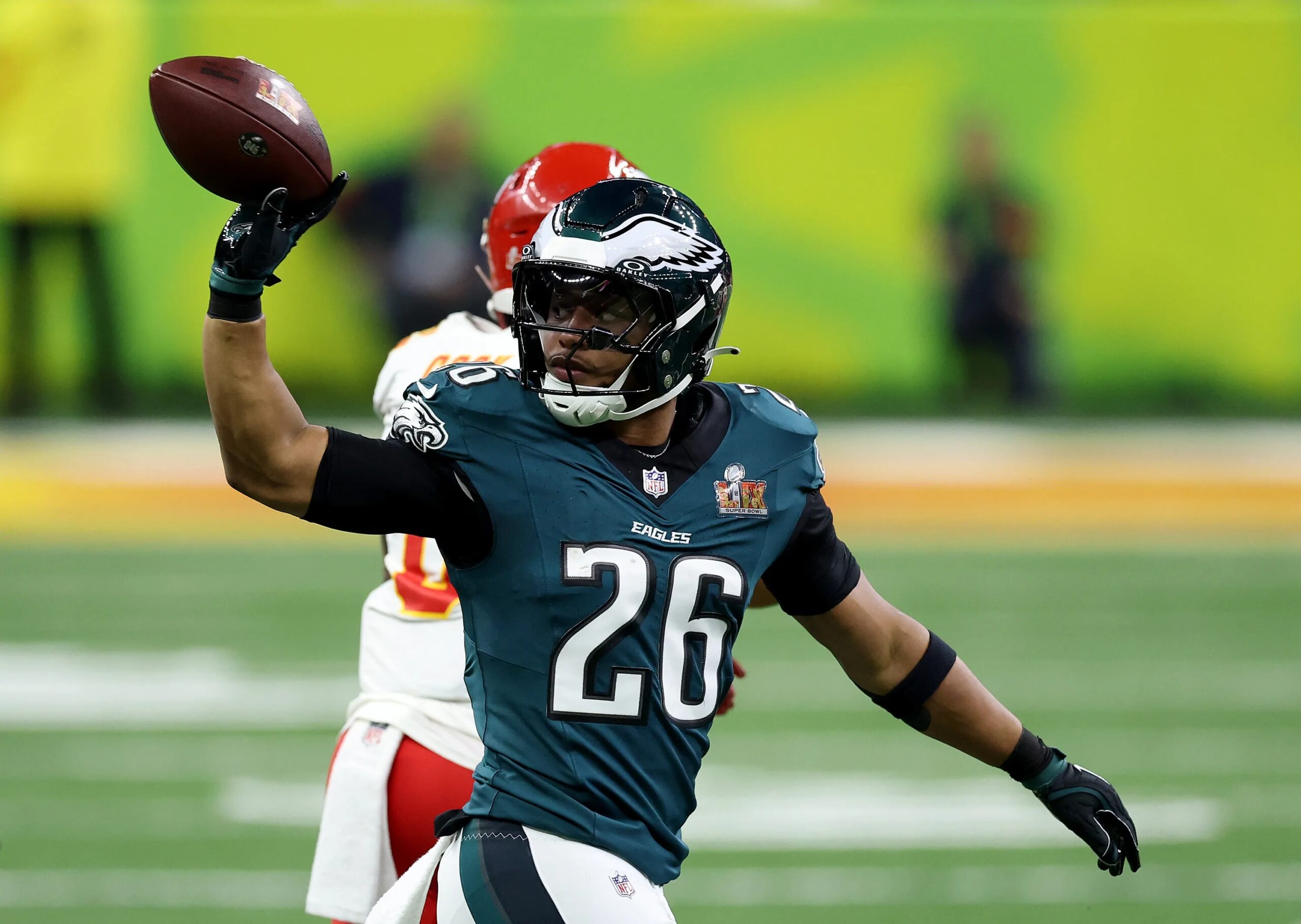
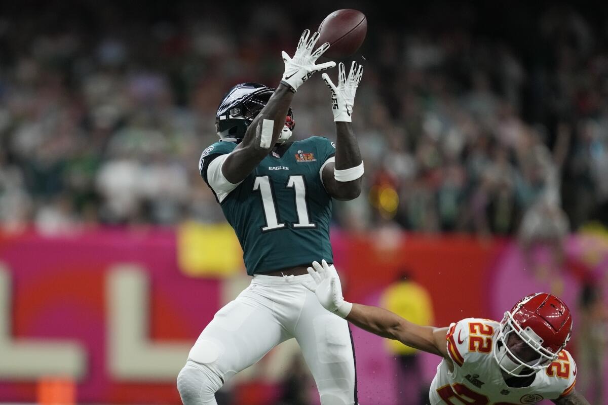
Plenty of attention during the Super Bowl goes beyond the players competing on the field. Companies aiming to promote their brands and television networks managing game coverage also see this as a big opportunity.
Fox, for instance, continued with the practice of introducing a refreshed design for its NFL coverage during this year’s Super Bowl broadcast.


The scoreboard, often called the scorebug, is usually where networks like to introduce design updates to enhance the appearance of the game for viewers.
Two years ago, Fox drew attention with a cartoon-style scorebug during the Super Bowl. This year, they decided to go in the opposite direction, using a design that leans toward a cleaner, more traditional presentation.
Graphic Change Leaves Viewers Unsure
Switching designs can come with pushback, especially when the one being replaced was still fairly new and well received.
The first impression of the new design can be a bit overwhelming. It makes use of large, bold fonts and includes several block elements. Though it aims to look simple, the graphic comes off as too aggressive and ends up drawing attention away from the match.
Adding some kind of background or difference might improve things, but for a game of this scale, the current presentation felt like it missed the mark.
It became clear from reactions that the audience didn’t appreciate the update. To help put the design in context, comparisons have been made with other versions of the scorebug that Fox has used through the years.
If the early responses are anything to go by, this year’s edition might land at the bottom of the list in terms of how it is remembered.


